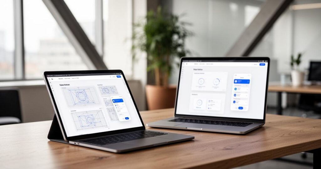
Building a website that genuinely works for visitors has become less about clever desktop layouts and more about how a design behaves in the palm of someone’s hand. With smartphones now dominating how people browse, shop and research online, designers who start their process on mobile screens rather than retrofitting desktop ideas tend to produce far more usable results. This article walks through inspiring mockup examples, the tools that bring them to life, and five practical tips for getting mobile-first design right from the very first sketch.
In short
- Mobile-first design is essential in today’s digital landscape, as smartphones are the primary tool for browsing, shopping, and research.
- Effective e-commerce mockups prioritize product visibility, simplified navigation, and intuitive touch interactions to improve conversion rates.
- Portfolio sites should balance visual personality with a clear hierarchy to communicate professionalism and manage storytelling without sacrificing mobile performance.
- Design tools like Figma, Sketch, and Adobe Express streamline the creation of mobile-optimized layouts by offering ready-made assets and efficient prototyping capabilities.
- Wireframing serves as the critical foundation for mobile-first projects, ensuring content prioritization and structural integrity before visual aesthetics are applied.
- Successful mobile web design relies on prioritizing user experience through simple navigation, readable typography, and optimized page load speeds.
Inspiring website mockup examples for your next project
Looking at real mockups is often the quickest way to understand what separates a mediocre layout from one that truly serves its audience. Good examples show how spacing, imagery and typography work together across different screen sizes, and they reveal the thinking behind decisions that might otherwise seem purely aesthetic. Whether you’re designing from scratch or refreshing an existing site, studying a variety of mockups helps sharpen your own instincts for what works.
E-commerce mockups: showcasing product-focused designs
Online shops face a particular challenge because they need to sell products while keeping the browsing experience effortless. The strongest e-commerce mockups place bold product photography front and centre, paired with concise pricing and a prominent add-to-basket button that’s easy to tap with a thumb. Given that most online retail traffic in 2023 came from smartphones, it’s no surprise that mobile optimisation has become the deciding factor in whether a shopper completes a purchase or abandons their basket. Effective mockups also tend to simplify filtering and search functions, recognising that cluttered menus are a common reason customers give up before checkout. Considering UK website traffic patterns and the continued rise in smartphone retail traffic, retailers ignoring this shift risk losing custom to competitors with slicker mobile journeys.
Portfolio and agency mockups: creative visual presentations
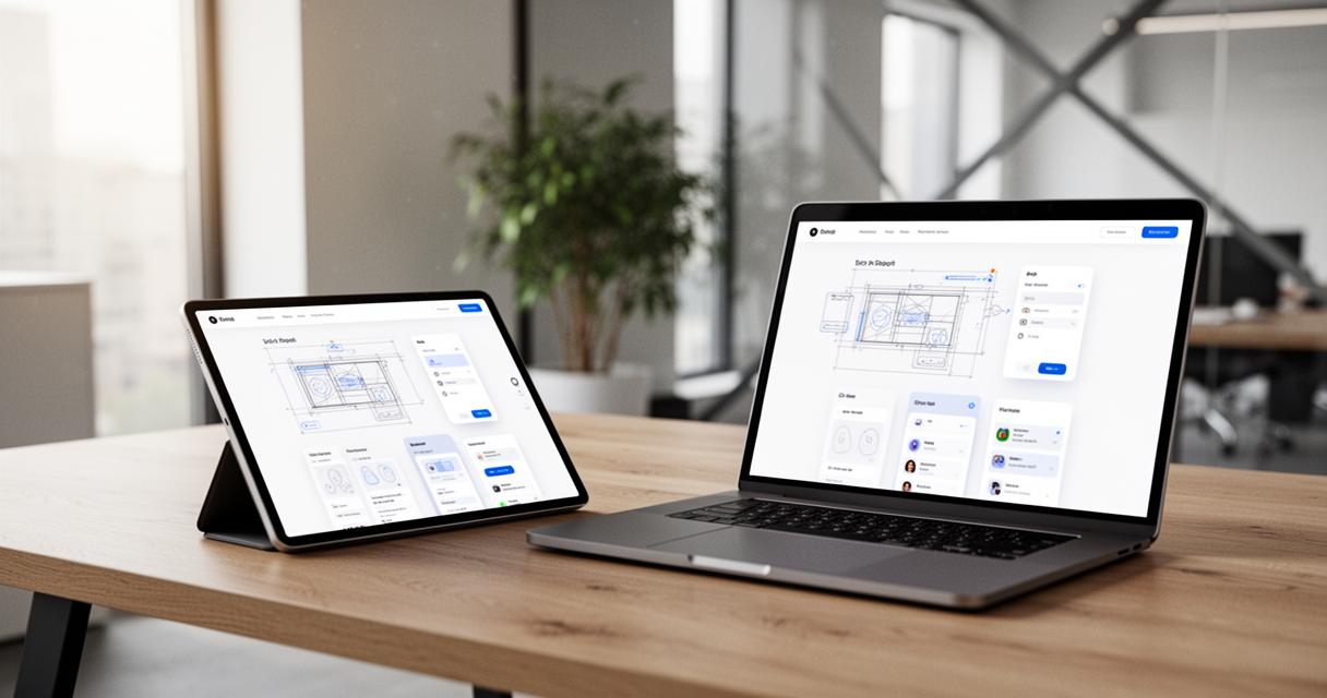
For creative agencies and freelancers, a portfolio site is often the first impression a potential client forms, so the mockup needs to balance personality with clarity. The best examples lean on strong visual hierarchy, guiding the eye from a striking hero image down through case studies without overwhelming the visitor. Graphic design plays a crucial role here, since typography choices, colour palettes and whitespace all communicate professionalism before a single word is read. Many agencies now build their mockups around storytelling, using scroll-triggered animations sparingly so that the mobile experience never feels sluggish or overloaded with unnecessary flourishes.
Essential Tools and Techniques for Creating Effective Mockups
Turning an idea into a polished mockup requires the right software and a disciplined process. Fortunately, today’s design tools make it straightforward to prototype quickly, test ideas with stakeholders, and adjust before a single line of code gets written.
Leading design software for professional web mockups
Platforms such as Figma, Sketch and Adobe Express have become staples for designers wanting to create mobile-first webpages efficiently. Adobe Express in particular offers a library of ready-made assets and design templates, allowing teams to identify content priorities early and build mockups without starting from a blank canvas. The process typically involves pulling relevant imagery and icons from the asset library, then arranging them using templates built specifically with smaller screens in mind. This approach saves considerable time while still producing designs tailored to genuine user needs rather than generic desktop conventions.
Wireframes as the Foundation of Your Design Process
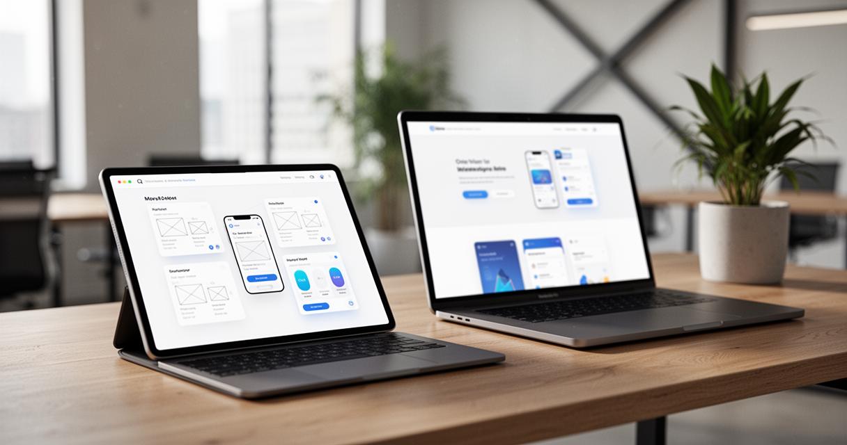
Before any colour or imagery enters the picture, wireframes strip a design down to its structural bones, showing where content, navigation and calls to action will sit. This stage is invaluable because it forces designers to think about content prioritisation without getting distracted by visual polish. A well-planned wireframe also makes it far easier to spot navigation problems or awkward layouts before they become expensive to fix. Since mobile-first design contrasts with graceful degradation, which starts with advanced desktop designs and simplifies them afterwards, wireframing for mobile from the outset ensures nothing essential gets lost when scaling up to larger displays through responsive design.
Five proven tips for mobile-first web design success
With mobile devices excluding tablets accounting for over sixty per cent of global website traffic as of 2025, there’s little room for guesswork. The following principles, drawn from established best practice, help designers build sites that perform well regardless of device.
Understanding your target audience and user experience priorities
Every successful mockup begins with a clear picture of who will actually use the site. Considering user experience priorities means thinking about touch navigation, readable font sizes and how thumbs naturally reach different parts of a screen. Accessibility should never be an afterthought either, since a genuinely inclusive design widens your audience rather than narrowing it. A few practical habits make a noticeable difference:
- Keep navigation simple and avoid burying important links in nested menus
- Prioritise readability with generous line spacing and appropriately sized text
- Design forms that are mobile-friendly, minimising fields and enabling autofill
- Optimise images so page load speed doesn’t suffer on slower connections
Poor mobile experiences cause visitors to leave within seconds and rarely return, so getting these fundamentals right protects both usability and reputation.
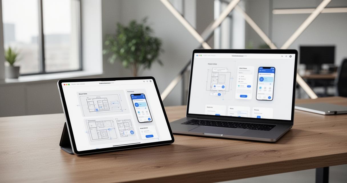
Implementing a Clear Project Charter and Design Workflow
A project charter that outlines goals, target devices and success metrics keeps teams aligned throughout development. Focusing on this document early avoids the common trap of redesigning halfway through a project because priorities weren’t agreed upfront. From there, a sensible workflow involves testing on real devices, refining calls to action, and treating mobile as the primary experience rather than a secondary consideration. The benefits extend well beyond aesthetics too, with improved SEO optimisation, stronger conversion rates and better brand perception all linked to sites that take mobile seriously. As we move towards 2026, a mobile-friendly website isn’t simply a nice addition but a genuine requirement for usability, search visibility and sustainable business growth.